
View modifiers allow you to customize the appearance and behavior of views. Here’s a list of common view modifiers with examples:
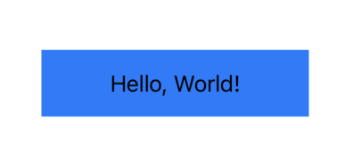
frame(width:height:alignment:)
Sets the width, height, and alignment of a view.
Text("Hello, World!")
    .frame(width: 200, height: 50, alignment: .center)
    .background(Color.blue)
padding(_:)
Adds space around a view. You can specify individual edges (e.g., .leading).
        Text("SwiftUI Padding")
            .padding()
            .background(Color.blue)
Or with specific edges:
Text("SwiftUI Padding")
    .padding(.leading, 20)
Text("SwiftUI Padding")
            .padding(.trailing, 20)
            .padding(.bottom, 20)
background(_:)
Sets a background view or color for the view.
        Text("Background Modifier")
            .padding()
            .background(Color.yellow)
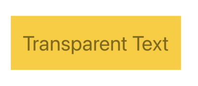
opacity(_:)
Adjusts the transparency of a view.
       Text("Transparent Text")
                .font(.title)
                .opacity(0.5)
Here is an example with background:
        VStack{
            Text("Transparent Text")
                .font(.title)
                .opacity(0.5)
        }
        .padding()
        .background(.yellow)
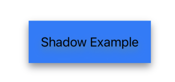
shadow(color:radius:x:y:)
Adds a shadow to the view. You can adjust the shadow’s color, radius, and offset.
        Text("Shadow Example")
            .padding()
            .background(Color.blue)
            .shadow(color: .gray, radius: 5, x: 0, y: 5)
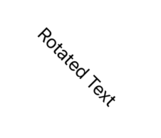
rotationEffect(_:)
Rotates a view by a specified angle.
        Text("Rotated Text")
            .rotationEffect(.degrees(45))
scaleEffect(_:)
Scales the size of the view.
   Image(systemName: "leaf")
                .scaleEffect(5)
           Text("Scaled Text")
                .scaleEffect(1.5)
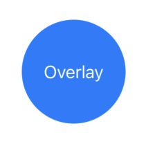
overlay(_:)
Places a view on top of another view.
        Circle()
            .fill(Color.blue)
            .frame(width: 100, height: 100)
            .overlay(Text("Overlay").foregroundColor(.white))
blur(radius:)
Applies a blur effect to a view.
        Image(systemName: "star.fill")
            .scaleEffect(5)
            .blur(radius: 3)

clipShape(_:)
Clips the view to a shape (e.g., Circle, Rectangle).
        Color.blue
            .frame(width: 100, height: 100)
            .clipShape(Circle())
foregroundColor(_:)
Sets the color of text or symbols within the view.
Text("Colored Text")
            .foregroundColor(.teal)
onTapGesture { }
Adds a tap gesture to the view.

import SwiftUI

struct ContentView: View {
    @State var counter = 0
    var body: some View {
        Text("\(counter)")
        Text("Tap Me")
            .onTapGesture {
                counter += 1
            }
    }
}
animation(_:)
Applies animation to view changes.
import SwiftUI

struct ContentView: View {
    @State private var scale: CGFloat = 1.0
    var body: some View {
        Text("Animated Text")
            .scaleEffect(scale)
            .onTapGesture {
                withAnimation {
                    scale = scale == 1.0 ? 1.5 : 1.0
                }
            }
    }
}
offset(x:y:)
Offsets the view by specific x and y values.

        Text("Offset Text")
            .offset(x: 20, y: 40)
            .background(.blue)
aspectRatio(contentMode:)
Maintains the aspect ratio for an image or shape.
        Image(systemName: "globe")
            .resizable()
            .aspectRatio(contentMode: .fit)
            .frame(width: 200)
transition(_:)
Defines the transition effect used when a view appears or disappears.
import SwiftUI
struct ContentView: View {
    @State private var isVisible = false
    var body: some View {
        Button("Toggle View") {
            withAnimation {
                isVisible.toggle()
            }
        }
        if isVisible {
            Text("Hello, SwiftUI!")
                .transition(.slide)
        }
    }
}
zIndex(_:)
Sets the stacking order of overlapping views.
       ZStack {
            Text("On Top")
                .offset(x: -20, y: -10)
                .zIndex(1)
            Text("Below")
                .zIndex(0)
        }
Another example:
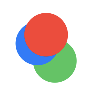
import SwiftUI
struct ContentView: View {
    var body: some View {
        ZStack {
              Circle()
                  .fill(Color.blue)
                  .frame(width: 100, height: 100)
                  .offset(x: -20, y: -20)
                  .zIndex(1) // Middle layer

              Circle()
                  .fill(Color.green)
                  .frame(width: 100, height: 100)
                  .offset(x: 20, y: 20)
                  .zIndex(0) // Bottom layer

              Circle()
                  .fill(Color.red)
                  .frame(width: 100, height: 100)
                  .offset(x: 0, y: -40)
                  .zIndex(2) // Top layer
          }
    }
}
alignmentGuide(_:computeValue:)
Customizes alignment within stacks or other containers.
 HStack(alignment: .top) {
            Text("SwiftUI")
                .alignmentGuide(.top) { _ in 10 }
            Text("Alignment Guide")
        }
allowsHitTesting(_:)
Controls whether the view can interact with touch events.
        Text("Untouchable")
            .padding()
            .background(Color.gray)
            .allowsHitTesting(false)
Here is another example. The counter will increase on tap gasture.

import SwiftUI

struct ContentView: View {
    @State var counter = 0
    var body: some View {
        Text("\(counter)")
        Text("Tap Me")
            .allowsHitTesting(false)
            .onTapGesture {
                counter += 1
            }
    }
}
gesture(_:)
Adds a gesture recognizer to a view, such as a drag, tap, or swipe.
import SwiftUI

struct ContentView: View {

    var body: some View {
        Text("Drag Me")
            .gesture(
                DragGesture()
                    .onChanged { value in
                        print("Dragging to: \(value.location)")
                    }
            )
    }
}
You will get output like this:
Dragging to: (4.666661580403655, 15.666656494140625)
Dragging to: (-54.333338419596345, 15.666656494140625)
Dragging to: (-81.00001017252603, 16.0)
Dragging to: (-83.66666666666666, 16.333328247070312)
Dragging to: (-84.00001017252603, 16.333328247070312)
Using a state variable, we can change the position of the text based on the drag gesture:
import SwiftUI

struct ContentView: View {
    @State private var position = CGPoint(x: 100, y: 100) // Initial position

    var body: some View {
        Text("Drag Me")
            .position(position)
            .gesture(
                DragGesture()
                    .onChanged { value in
                        self.position = value.location // Update position during drag
                    }
            )
    }
}
mask(_:)
Applies a mask to the view, shaping it with another view.
        Image(systemName: "globe")
            .resizable()
            .frame(width: 100, height: 100)
            .mask(Circle())
compositingGroup()
Combines the view and its child views into a single compositing layer, useful for complex rendering.

        VStack {
            Text("SwiftUI")
                .padding()
                .background(Color.red)
        }.compositingGroup()
            .blur(radius: 5)
blendMode(_:)
Changes how a view is blended with its background (e.g., multiply, screen, overlay).
        Image(systemName: "globe")
            .blendMode(.multiply)
brightness(_:)
Increases or decreases the brightness of a view.

   Image(systemName: "globe")
            .resizable()
            .frame(width: 100, height: 100)
            .brightness(0.8)
contrast(_:)
Adjusts the contrast of the view.
Image(systemName: "globe")
            .resizable()
            .frame(width: 100, height: 100)
            .contrast(1.5)
saturation(_:)
Modifies the color saturation of the view.
Image(systemName: "globe")
            .resizable()
            .frame(width: 100, height: 100)
    .saturation(0.5)
hueRotation(_:)
Rotates the view’s colors based on hue.
        Image(systemName: "globe")
            .resizable()
            .frame(width: 100, height: 100)
            .hueRotation(.degrees(45))
contentShape(_:)
Defines a custom tappable area for the view.
     Rectangle()
            .fill(Color.blue)
            .frame(width: 100, height: 100)
            .contentShape(Circle()) // Only circular area is tappable
            .onTapGesture {
                print("Tapped inside circle area")
            }
layoutPriority(_:)
Determines how much space a view should take up relative to other views.
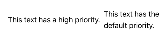
        HStack {
            Text("This text has a high priority.")
                .layoutPriority(1)
            Text("This text has the default priority.")
        }
matchedGeometryEffect(id:in:)
Creates smooth transitions between views by sharing geometry data, commonly used in animations.
import SwiftUI

struct ContentView: View {
    @Namespace private var animationNamespace // A unique namespace for the matchedGeometryEffect
    @State private var isExpanded = false

    var body: some View {
        VStack {
            if isExpanded {
                RoundedRectangle(cornerRadius: 25)
                    .fill(Color.blue)
                    .frame(width: 300, height: 200)
                    .matchedGeometryEffect(id: "rectangle", in: animationNamespace)
                    .onTapGesture {
                        withAnimation(.spring()) {
                            isExpanded.toggle()
                        }
                    }
            } else {
                RoundedRectangle(cornerRadius: 25)
                    .fill(Color.blue)
                    .frame(width: 100, height: 100)
                    .matchedGeometryEffect(id: "rectangle", in: animationNamespace)
                    .onTapGesture {
                        withAnimation(.spring()) {
                            isExpanded.toggle()
                        }
                    }
            }
        }
    }
}
lineLimit(_:)
Limits the number of lines a text view can display.
Text("This is a long line of text that will be truncated.")
    .lineLimit(1) // Limits to 1 line
multilineTextAlignment(_:)
Aligns the text in multi-line views (e.g., .leading, .center, .trailing).
Text("This is a multi-line\ntext with alignment.")
    .multilineTextAlignment(.center)
font(_:)
Sets the font of a text view.
Text("Custom Font")
    .font(.title)
textCase(_:)
Changes the case of text (e.g., .uppercase, .lowercase).
Text("Lowercase text")
    .textCase(.uppercase)
accessibilityLabel(_:)
Adds an accessibility label for VoiceOver.
Image(systemName: "star.fill")
    .accessibilityLabel("Favorite")
onAppear and onDisappear
Triggers actions when a view appears or disappears.
        Text("Hello, World!")
            .onAppear {
                print("View appeared!")
            }
            .onDisappear {
                print("View disappeared!")
            }
animation(_:value:)
Associates an animation with a view property that updates based on changes in a bound value.
import SwiftUI
struct ContentView: View {
    @State private var scale = 1.0
    var body: some View {
        VStack {
            Button("Animate") {
                scale = scale == 1.0 ? 1.5 : 1.0
            }
            .animation(.easeInOut(duration: 0.5), value: scale)
        }
        .scaleEffect(scale)
    }
}
onChange(of:perform:)
Listens for changes in a state or binding, useful for tracking specific property updates.
import SwiftUI
struct ContentView: View {
    @State private var text = ""
    var body: some View {
        TextField("Enter text", text: $text)
            .onChange(of: text) {
                print("Text changed to: \(text)")
            }
    }
}
disabled(_:)
Enables or disables interaction with the view.
Button("Click Me") {
    print("Button clicked")
}
.disabled(true) // Button is disabled
foregroundStyle(_:)
Applies a gradient or another color style to the foreground.
Text("Styled Text")
    .foregroundStyle(LinearGradient(
        colors: [.blue, .purple],
        startPoint: .leading,
        endPoint: .trailing)
    )
textSelection(_:)
Enables or disables text selection.
Text("This text is selectable.")
    .textSelection(.enabled)
allowsTightening(_:)
Determines if text can be tightened to fit within bounds, improving readability.
Text("Long Text that might need tightening")
    .allowsTightening(true)
minimumScaleFactor(_:)
Allows text to scale down to fit within the view’s bounds.
Text("This text will scale to fit.")
    .font(.largeTitle)
    .minimumScaleFactor(0.5)
lineSpacing(_:)
Sets the spacing between lines in multi-line text.
Text("This is some\nmulti-line text")
    .lineSpacing(10)
truncationMode(_:)
Determines where text truncation occurs (e.g., .head, .middle, .tail).
Text("This is a long text that might be truncated.")
    .truncationMode(.tail)
autocapitalization(_:)
Configures automatic text capitalization in text inputs (e.g., .words, .sentences).
TextField("Name", text: $name)
    .autocapitalization(.words)
keyboardType(_:)
Specifies the keyboard type for a text input (e.g., .emailAddress, .numberPad).
TextField("Email", text: $email)
    .keyboardType(.emailAddress)
focusable(_:)
Defines whether the view can be focused, useful for macOS and accessibility.
Text("Focusable Text")
    .focusable(true)
submitLabel(_:)
Specifies the return key label in a text field (e.g., .done, .search).
TextField("Search", text: $query)
    .submitLabel(.search)
fixedSize(horizontal:vertical:)
Fixes the view’s size to prevent it from resizing to fit content.
Text("Fixed Size Text")
    .fixedSize(horizontal: true, vertical: false)
keyboardShortcut(_:modifiers:)
Assigns a keyboard shortcut to the view, useful for macOS.
Button("Save") {
    print("Saved!")
}
.keyboardShortcut("s", modifiers: [.command])
accessibilityHidden(_:)
Hides the view from accessibility tools like VoiceOver.
Text("Hidden from accessibility")
    .accessibilityHidden(true)
accessibilityHint(_:)
Provides a hint for accessibility tools, describing the function of the view.
Button("Info") {
    print("Info clicked")
}
.accessibilityHint("Shows more information")
accessibilityAddTraits(_:)
Adds specific traits for accessibility (e.g., .isHeader, .isButton).
Text("Header")
    .accessibilityAddTraits(.isHeader)
accessibilityValue(_:)
Sets a custom value for accessibility, especially useful for progress indicators.
ProgressView("Loading", value: 0.7)
    .accessibilityValue("70% complete")
tint(_:)
Sets the tint color for controls such as buttons and toggle switches.
Toggle("Enable feature", isOn: $isOn)
    .tint(.green)
redacted(reason:)
Applies a redacted (placeholder) effect, useful for loading states.
Text("Loading data...")
    .redacted(reason: .placeholder)
confirmationDialog(_:isPresented:titleVisibility:actions:)
Creates a confirmation dialog, often used as an action sheet.
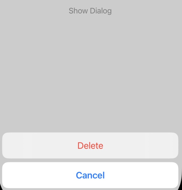
import SwiftUI
struct ContentView: View {
    @State private var showDialog = false
    var body: some View {
        Button("Show Dialog") {
            showDialog.toggle()
        }
        .confirmationDialog("Are you sure?", isPresented: $showDialog) {
            Button("Delete", role: .destructive) {}
            Button("Cancel", role: .cancel) {}
        }
    }
}
task(priority:_:)
Executes an asynchronous task when the view appears.
Text("Loading Data")
    .task {
        // Load data asynchronously
    }
listRowBackground(_:)
Sets the background of a row in a list.
        List{
            Text("Row 1")
            Text("Row 2")
        }
        .listRowBackground(Color.gray)
listRowSeparator(_:edges:)
Controls the visibility and positioning of row separators in lists.
List {
    Text("Row 1")
    Text("Row 2")
}
.listRowSeparator(.hidden)
refreshable(action:)
Enables pull-to-refresh functionality in lists.
List(items) { item in
    Text(item)
}
.refreshable {
    // Refresh action
}
badge(_:)
Adds a badge, typically used for items in TabView.
TabView {
    Text("Home")
        .tabItem {
            Image(systemName: "house")
            Text("Home")
        }
        .badge(3) // Badge with count
}