Form is a container that groups input elements like text fields, buttons, toggles, and pickers in a structured layout commonly used for data entry. It’s often used for settings pages, registration forms, or any situation where user input is required. Form automatically arranges and spaces out its child views, making it an ideal choice for creating structured user interfaces.
Basic Structure
The basic structure of a Form in SwiftUI looks like this:
Form {
    // Input fields, toggles, etc.
}
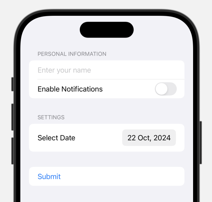
Simple Example
Here’s a simple example of a form with several different types of controls:
import SwiftUI

struct ContentView: View {
    @State private var name: String = ""
    @State private var isOn: Bool = false
    @State private var selectedDate = Date()

    var body: some View {
        Form {
            Section(header: Text("Personal Information")) {
                TextField("Enter your name", text: $name)
                Toggle(isOn: $isOn) {
                    Text("Enable Notifications")
                }
            }

            Section(header: Text("Settings")) {
                DatePicker("Select Date", selection: $selectedDate, displayedComponents: .date)
            }

            Button("Submit") {
                print("Form submitted")
            }
        }
    }
}


#Preview {
    ContentView()
}
In this example:
TextField: Allows the user to input text.Toggle: Allows the user to toggle a setting on or off.DatePicker: Lets the user select a date.Button: A button to trigger an action (in this case, form submission).
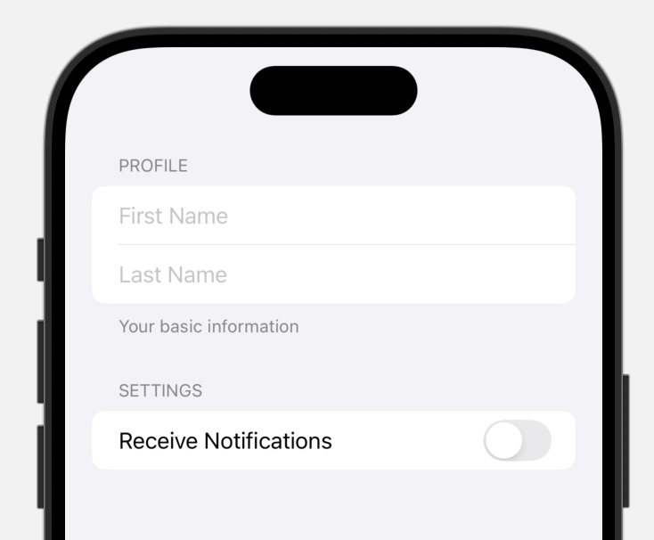
Using Sections
Form allows you to group inputs into sections, which can have headers and footers for better organization.
import SwiftUI

struct ContentView: View {
    @State private var firstName: String = ""
    @State private var lastName: String = ""
    @State private var receiveNotifications: Bool = false


    var body: some View {

        Form {
            Section(header: Text("Profile"), footer: Text("Your basic information")) {
                TextField("First Name", text: $firstName)
                TextField("Last Name", text: $lastName)
            }

            Section(header: Text("Settings")) {
                Toggle(isOn: $receiveNotifications) {
                    Text("Receive Notifications")
                }
            }
        }

    }
}


#Preview {
    ContentView()
}

- Sections: Used to group related form items together.
- Header and Footer: You can specify a
Textview as a header or footer for each section.
Built-in Form Controls
SwiftUI’s Form supports a variety of input controls. Some of the most common are:
TextField: For text input.SecureField: For password input (hides the characters).Toggle: A switch for enabling or disabling a setting.Stepper: For incrementing or decrementing a numeric value.Picker: For selecting from a list of options.DatePicker: For selecting a date or time.
Example with More Controls
Stepper: Allows you to increment or decrement a numeric value.ColorPicker: Allows users to select a color.
Customizing the Appearance
You can further customize the form using various SwiftUI modifiers like .padding(), .background(), or .font() to change the appearance of the Form or individual elements.
Example: Registration Form
Here’s an example of a more complete registration form:
import SwiftUI

struct ContentView: View {
    @State private var name: String = ""
    @State private var age: Int = 18
    @State private var notificationsOn: Bool = false
    @State private var selectedColor: Color = .blue

    var body: some View {
        Form {
            Section(header: Text("User Info")) {
                TextField("Name", text: $name)
                Stepper("Age: \(age)", value: $age, in: 1...100)
            }

            Section(header: Text("Preferences")) {
                Toggle("Enable Notifications", isOn: $notificationsOn)
                ColorPicker("Favorite Color", selection: $selectedColor)
            }

            Button("Submit") {
                print("Form submitted")
            }
        }
    }
}

#Preview {
    ContentView()
}
SecureField: Used for password input, hiding the entered characters.DatePicker: Lets users select their birthdate.Toggle: Allows users to subscribe to newsletters.
Form Validation Example
You can also use Form in conjunction with form validation logic:
import SwiftUI

struct ContentView: View {
    @State private var username: String = ""
    @State private var password: String = ""
    @State private var showAlert = false

    var body: some View {
        Form {
            Section(header: Text("Login Information")) {
                TextField("Username", text: $username)
                SecureField("Password", text: $password)
            }

            Button("Login") {
                if username.isEmpty || password.isEmpty {
                    showAlert = true
                } else {
                    print("Logged in successfully!")
                }
            }
            .alert(isPresented: $showAlert) {
                Alert(title: Text("Error"), message: Text("Please fill out all fields"), dismissButton: .default(Text("OK")))
            }
        }
    }
}

#Preview {
    ContentView()
}
Here:
- Form validation: The form checks if the username and password are filled out before allowing submission.
SwiftUI Form provides a simple and efficient way to create forms and gather user input, offering several built-in controls and automatic layout management. It is commonly used for settings, data entry, and configuration screens.
- Input Controls: Use controls like
TextField,Toggle,DatePicker, etc. - Sections: Group related fields for better structure.
- Customization: Modify the form’s appearance using SwiftUI modifiers.
- Validation: Add validation logic for more complex forms.